Top 5 challenges in website usability

Based on our experience, we collected five of the most common issues that pose a challenge to users, especially on websites.
We meet dozens of users in usability tests and see nearly 200 different digital services every year. Based on our experience, we collected five of the most common issues that pose a challenge to users, especially on websites. Paying attention to these will make your web site more usable and the user experience smoother.
1. Forms
Forms can be long applications, small parts of a purchase funnel, or just login fields. The site asks the user for some information and lets them move forward. It is surprising how often specifically the forms are likely to accumulate usability problems.
- Design forms and form texts carefully. Pay attention to target groups and language that they understand.
- Importing a form from paper to web as such is not enough. Different environments require different approaches. A smooth user experience is generated by designing the form into the digital world.
- Encourage the designer, developer, and content provider to work closely together. Many misunderstandings result from, for example, the web form being poorly grouped, explanatory texts being in the wrong place or the user being unable to find additional information they need.
- Make sure that the mandatory fields are clearly marked and tell precisely what should be entered in the input field. Try to prevent user’s mistakes.
- Make sure the user receives the right kind of feedback. Forms are interactive elements, and users expect a reaction to their own actions. If something has been entered incorrectly, tell how the error can be fixed.
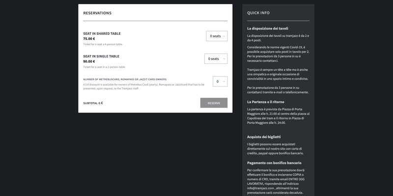
On the TramJazz page tickets can only be bought in even numbers. This is possibly explained in Italian in the instructions on the right, at a different point than where the selection is made. As tickets have to be bought in pairs, there is also the question whether the price showing is for one or two tickets.
2. Navigation
Dividing a web site into perceptible and understandable elements is a common challenge. The menus, breadcrumbs trails, and steppers are meant to help the user in their task, which can be, for example, finding information or making a purchase. Sometimes different navigational elements rather confuse the user's behavior.
- Include all relevant sections of the site in the menus and name them clearly. Do not rely on the user finding everything relevant only on the content area of the pages.
- Do not include links that leave the site to the menus. Also avoid adding links to pages with a different page template (for example, where the menu disappears).
- Avoid exotic menu solutions. Familiarity and transparency are the keys in navigation.
- Breadcrumbs trail is useful for larger sites. It makes it easier for the user to figure out where they are on the site.
- Mobile navigation is its own world. For example, a hamburger menu is not familiar to everyone. If you are using a hamburger menu, at least ensure its adequate visibility and distinction.
- Test especially the navigation structure with real users. They may be looking for entirely different things or perceive the data structure quite differently than you imagined.

The University of Advancing Technology has two menus. The main menu on the left is hidden by default and not clearly reachable instantly. The other menu seems to be in the footer. To reach the footer you have to unconventionally scroll to the right. The menus appear to have some duplicate content, and no clear logic how the content is divided into these.
3. Links and Buttons
Sites have a wide range of navigation elements: heading links, content links, forward buttons, featured content, shortcuts, carousels, pictures, buttons. In addition to the main navigation, the user often has many other options to move forward on the site.
- Make sure the links and buttons are clearly distinguished from other elements and invite you to click.
- Make sure the links and buttons are consistent. They look the same and work consistently within the service.
- Use cross-linking boldly so that information belonging together can be found in the same place and it is be easy to create an overall idea.
- If a link leads away from the page or, for example, opens a pdf file, explicitly spell this out in the link. This way, the user does not get lost or get surprised.
4. Headings
Increasingly, users end up on subpages through search engines, instead of coming to the front page first. Headers play a great role in, for example, whether search works properly. The user wants to move forward easily, and they want to easily find the content they are looking for.
- Name the links and corresponding page titles in the same way.
- Headings must be unique.
- Keep headlines short and descriptive.
- Headings should correspond to the text and not just act as baits.
5. Body text
Text content affects greatly the usability of the entire service. When compiling a site's texts, the main rule of thumb is that users often do not read the texts properly. They do not go through the site and its content systematically, but look at the views quickly to find the information they need. That's why speed and clarity are the key.
- Keep sentences and paragraphs short and concise.
- Adequate subtitling will make reading faster and easier.
- Instead of prose text, or in addition to it, favor easily scannable lists.
- Visualizations make it easier to understand text.
When designing online services, you should pay attention to all of the above. So how can you succeed? Test, iterate, and test, preferably with real end-users of the service.
Published:
Updated: